Aspiring printmaker and surface designer about to start an MA in Printmaking at Camberwell 2013. Contact: melissafairchild_88@hotmail.co.uk
17 March 2011
9 March 2011
4 March 2011
1 March 2011
Vous parlez English?
A new postcard/ stationary set playing on things I heard over a recent ski trip being used in the wrong context by both nationalities. I decided to play on this and create translations of some colloquial phrases. Still working on them and need to design the packaging for them.
London reasearch
On my last trip to London to drop off a portfolio I had a longggggggg gander, as I always do at the stationary section in Selfridges. These were some of my favorite bits on sale. As well as this there are a couple of pictures of my mum's design studio. Some of my favorite interior designers and their books. Pattern has always been a large part of my life, so I thought I would give you a few references.
17 February 2011
16 February 2011
10 February 2011
David Prosser
I really like recent RCA graduate's subtle use of film. Im not an animation buff, so its more about the images created and the feel of the animation for me here. Sort of eerie don't you think?!
http://www.daveprosser.co.uk/
The Chase
Really liked this company after seeing it on a friends blog. I found this letter set particularly enticing and witty. A hairdresser in the downstairs and a seafood restaurant in the upstairs of the address. Genius!
9 February 2011
Cross Bred Bird Prints
I started to play around with the idea of city birds cross breeding (doves and pigeons etc) and you could say I took it to the extreme a little playing around and making mythical birds that I then took into screen print.
30 January 2011
28 January 2011
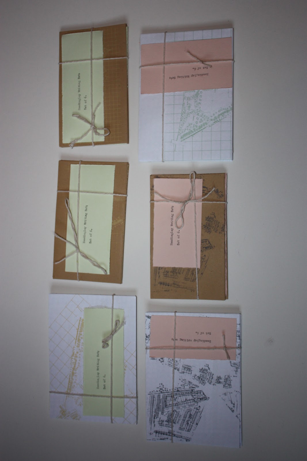
Headingley Writing Sets
This project came from a year long exploration of experimental travel and that of personal and emotional map making. In this piece of work I wanted to explore the relationship with the environment around us and how we direct people in an unknown environment. I posed as a tourist in an area where I live; in doing this I asked the public directions in order to get to a certain place within the city. Directions can easily be given on a map, however in reality we rely on landmarks or mental images in order to navigate ourselves around the real world. I therefore decided to start experimenting with dissecting maps of the local area; cutting out the parts of the map that were given to me through word of mouth. I then included the said direction, embossed on a piece of writing paper within the set. In doing this I hoped to juggle the uses of cartography and spoken word. Questioning if both can work side by side. I felt by making a writing set out of the images and information I could create a product that was both personal to the people of the area; in that they would most probably understand the written directions and landmarks of the local area. As well as being informative to the people who receive the message or letter sent to them.
This piece of work also got shortlisted in the Graphic Design catergory for the Northern Design Competition 2010.
Subscribe to:
Posts (Atom)